-
Automations
-
Integrations
-
Import & Export
-
Privacy and Security
-
Infinity Partner Programs
-
Announcements
Chart
Infinity’s Chart view will be a great solution for those who want to represent and analyze their data in a visual way. With Charts, you will be able to create reports out of your data and display those reports through various types of charts.
The most obvious use case would be working with metrics, when you need to analyze numeric data over time. But Charts can help you do so much more using different attributes as parameters. So you’ll be able to monitor your team’s performance, measure KPIs, track your sales, etc.

How to Use the Chart View
As mentioned, Charts will let you display and analyze your data, therefore, you will not be able to add new items while you are in this view.
Once you open a Chart view, you will need to decide how your chart will look and what data you wish to analyze.
So let’s first talk about the main sections of this view.
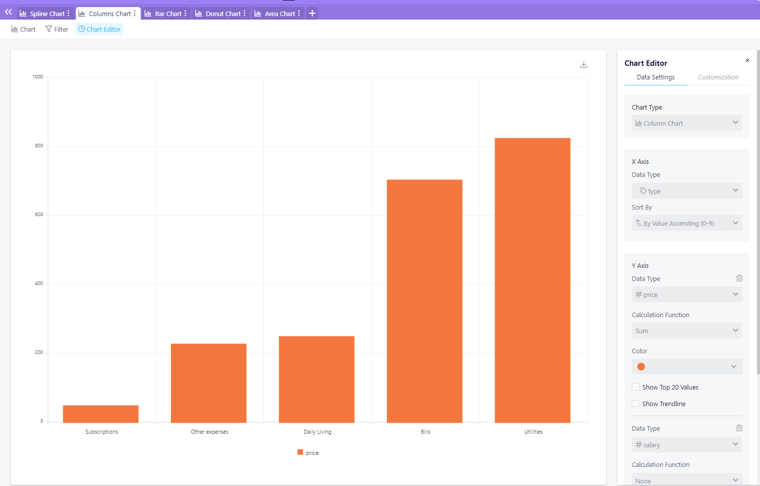
In the central part, you will be able to see your chart.
{primary} NOTE: In the Line chart, when using Date as X Axis value, at the top right corner you will see some additional options such as: zoom in, zoom out, move cursor, home (set to default size) and download chart as SVG, PNG and CSV.
In the top toolbar, as in all other views, you will see the filtering option. Right next to the Filter, you will see the Editor. This button will serve to open and close the Chart Editor you can see on the right side. In the Editor, you will see one tab with Data Settings and another one with Customization.
We will explain all Editor elements below.
Data Settings
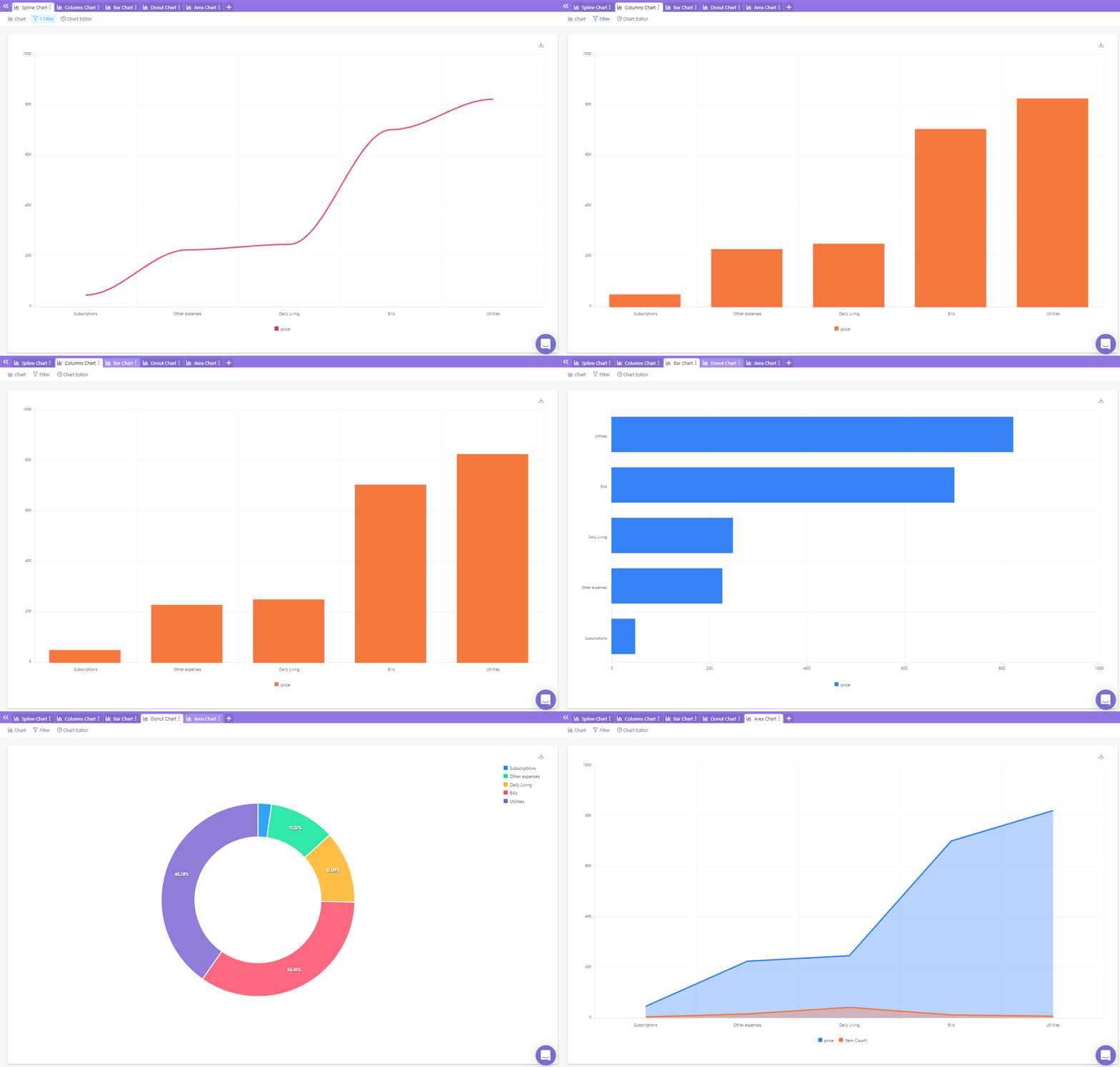
Choose a Chart Type - You will be able to choose among 13 different chart types from 5 categories: Line, Columns, Bar, Pie and Area.

Set the X Axis (Horizontal) - Choose which data type you would like to set as your X Axis. Here you can also decide whether you want to sort your data and how.
Set the Y Axis (Vertical) - Choose which data type you would like to set as your Y Axis, including attributes and item count. If you choose one of the attributes, you will also need to choose the calculation function. Here, you will also be able to set the line color or add a trendline.
For the Y Axis, you will be able to add multiple data series.
Pie Chart will work a bit differently, and instead of X Axis and Y Axis, you will set the Label and Value - which you will also be able to choose among the attributes.
{primary} NOTE: Keep in mind that for both X and Y Axis, the attributes you can use as parameters will depend on the chart type you choose.
Define the Benchmark - If needed, you can add and define one or more benchmark lines. Once you click to add a benchmark, you will see the options to define its type, label, value and color.
Customization
In the Customization part, you will be able to choose which elements you will be able to see in your chart and which not.
Here are the options you will be able to show/hide:
- Show X Axis Labels
- Show Y Axis Labels
- Show Legend
- Show Tooltips (which are available on hover)
- Show Grid